Having quality and professional product photos makes a big difference in how customers perceive your brand.
[form name=”get-tips” text=”Receive free ecommerce & product photography tips” align=”right”]
While post-production is essential, quality product photos start with your shoot. In this article, we’ll look at how to make the most of your shoot by choosing the right colors for your background. We’ll also share a few best practices to help get your product photos to the finish line looking great and ready to wow your customers.
In this article:
- Why color matters
- What color is your product?
- Additional considerations for choosing the color for your product background
- What is the best color for your product background?
- Post-production essentials
- Adding backgrounds after the shot
Why color matters
Photos are your opportunity to showcase your products and tell your brand’s story. What better way to do so than using color to evoke the right mood and feel? Color can take an otherwise ordinary product and make it pop off the page.
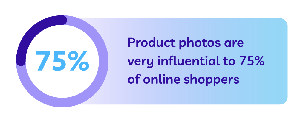
According to one survey, more than three-quarters online shoppers rate product photos as very influential on their online purchase decision. Throwing together product photos with a background color that doesn’t mix puts you at a disadvantage from the start.
Not only does color help display your products more distinctly on the web and in catalogs, it also has a subconscious effect on people’s moods.
“Color is one of the most powerful tools to express emotions. Studies of involuntary physical reactions, such as eye movements, brain activity, and heart rate have shown that when we see colors, they trigger a very rapid and strong reaction. Colors communicate with us on an unconscious and non-verbal level,” writes Monika Lindquist, marketing strategist at market research firm Straylight.
Using color strategically, you can evoke the emotions you want your shoppers to feel when interacting with your brand and products. While often an afterthought in marketing and business, color can go a long way in influencing your customers and ultimately play a role in how they relate to you and your brand.
The right color combinations will not only help you highlight your product features, but the right color background can really make your products come to life. According to research conducted at the Seoul International Color Expo 92.6% of respondents believe visual factors are the most important when purchasing products.
Furthermore, 22% of returns occur because the product looks different in person than it did in the photos. The colors you choose for your shoot aren’t just to make your product look good — they show shoppers exactly what they can expect from their order.
Understanding the role color plays allows you to make the right decisions for your shoot, but how can you choose the right background for your product photos? That depends on a variety of factors.
What color is your product?
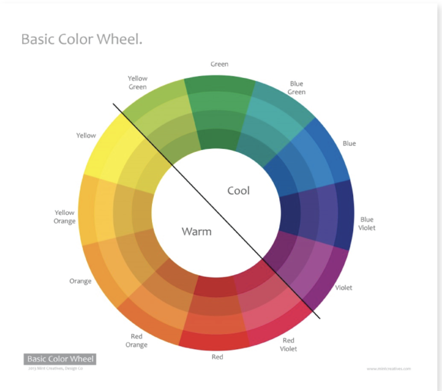
When deciding on your background color, one of the most important things to consider the color or colors of your product. Some colors play well with others, and some, not so much.
[tweetquote text=”“When shooting, make sure the product or object you want to feature shines.” – Mark David, professional photographer”]
Before your shoot, confirm with your team which products you’re capturing — make a shot list to help — and spend an hour or so auditing the colors of each. If you have a wide range of product colors, you can decide on multiple backgrounds to experiment with throughout the shoot.

Image source
A white background is a ‘safe’ choice but can come with some disadvantages, which we’ll discuss below. A light or neutral color also works great for most products.
“If the product you’re shooting has a lot of warm tones, a cool color for the background could help the item really stand out. Using a light background with a dark color product (or vice versa) would give your image a lot of contrast, which is especially useful when shooting product imagery for a website,” says design manager of Nations Photo Lab, Niki Maro. “Alternately; matching a product and background with similar tones would make a much calmer, more nuanced image that could look more sophisticated but have less pop.”
Whatever background color you choose, you want to be able to clearly see your product. If the background overshadows the product or makes it difficult to see, that’s a clear sign you’ll want to try something different.
“When shooting, make sure the product or object you want to feature shines,” says professional photographer Mark David. ”The backdrop should never distract the viewer’s eye from the main subject. You don’t want loud, patterned backdrops.”
Image source
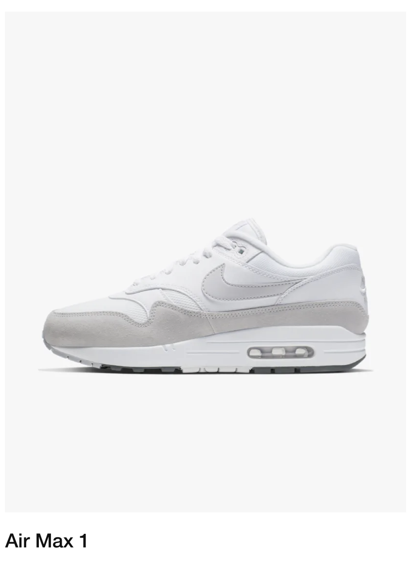
Image source
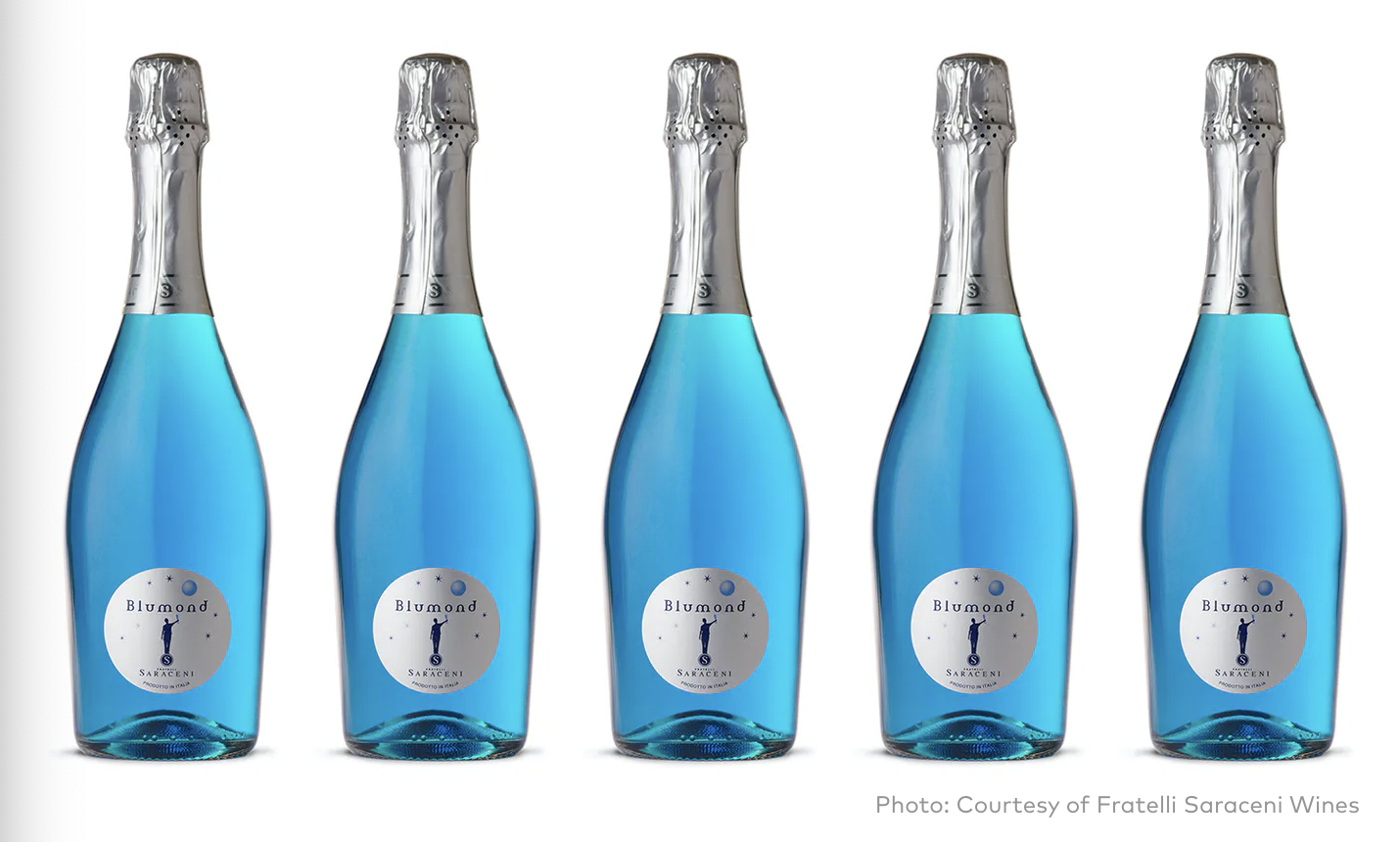
Image source
Finding the right balance comes down to experimentation. Keep in mind that you can always change the background color in post-production using a color change service if the shoot doesn’t go exactly according to plan.
Additional considerations when choosing colors for your product background
While product color has perhaps the largest impact on which color background you should use during your shoot, there are some other considerations to take into account as well.
Models vs. no models
More than half of the top fashion websites use people in their product photos — and most use a mix of plain background and lifestyle product photography. Models can undoubtedly help further enhance your product photos by showing what they look like in real life. If you plan to use models during your shoot, it’s crucial to consider model hairstyles, clothing, and even skin tone.
Remember, models play an important role in highlighting your products. But in most cases, they shouldn’t be the main focus.
Spend time with your team and photographer and think through how your model’s hairstyle, clothing, and skin tone work with your background color to make your products shine. When possible, establish who your models are in advance, as well as which background colors you’re hoping to use.
Additionally, before your shoot, it’s helpful to create multiple looks and themes beforehand, so you know what to expect. Working with a stylist can also help ensure your models and products complement one another as well. If you do want your models to be the focus of your shoot, consider using less “flashy” colors to keep the focus on them. “Make sure your model wears non-distracting clothes — solid color is best — and photograph somewhere with a background that isn’t too busy,” says professional photographer Nick Agro.
Sometimes, shoots with models require more than just a solid color background. Lifestyle photography can also have contextual backgrounds, in which case it’s still important to consider which colors will appear.
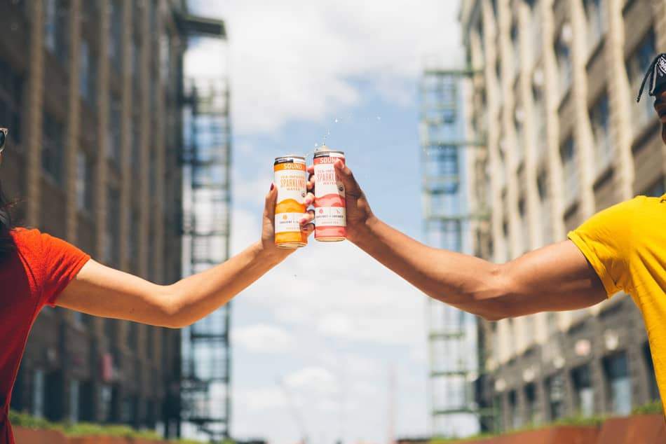
Image source
Lighting
In addition to considering your products colors and models (if you plan on having any), don’t overlook the importance of lighting to enhance your photos. Effective use of lighting can often be the difference between a ‘meh” product shoot and one that has your team beaming with pride.
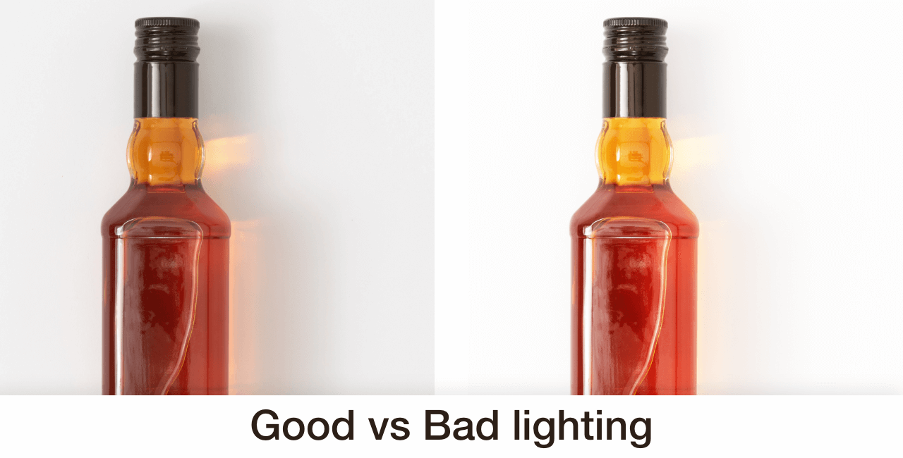
Image source
Will your shoot location have natural light? Or will you rely heavily on flash or indoor lighting? If shooting outside, don’t forget to plan around the weather as that can significantly impact your overall lighting. Having a backup location is always a great way to plan for the unexpected.
According to HubSpot, product shots do well in natural light if:
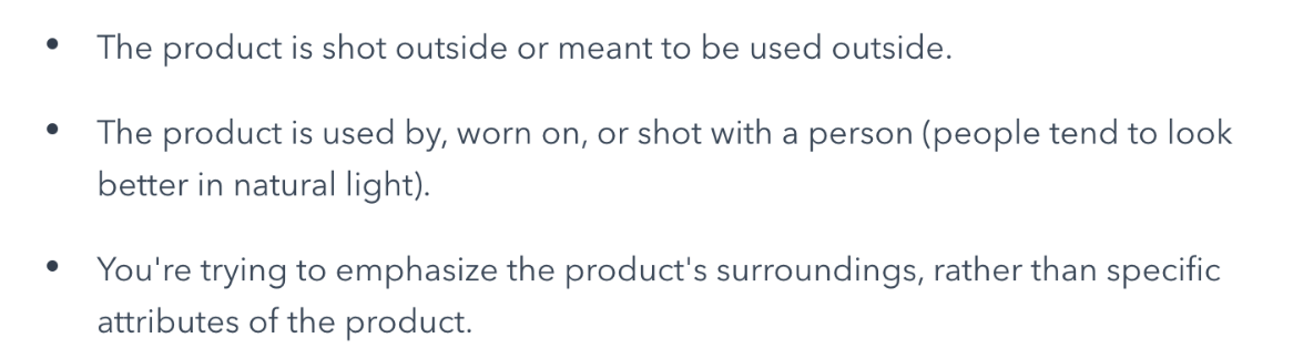
“Think about the overall feeling or mood you want to portray and use a light source to match. You can use harsh direct light for an edgier feel, or go with soft light from a window for a more subdued tone,” says professional photographer Nick Agro.
At the end of the day, he says simple is better. “Props can add a lot to your shoot, but if overdone, you’ll overshadow your product,” he says.
Pro tip: Take more shots than you think you need
Photoshoots require a lot of time and resources to pull off, which is why it’s a good idea to take more shots than you think you need. Experiment with different lighting and try different angles. The more photos you have, the more options you have during post-production.
It’s better to spend a little more time on the shoot and have more photos than you need than wishing you had when you start post-production. Besides, you can always cull them later.
What is the best color for your product background?
While there are many ‘best practices’ out there to help choose the right colors, not all products (and backgrounds) are created equal. Rely on your photographer’s direction and go into the shoot with a few different options to avoid wasting a day of shooting.
When you want to add some color to the background, consider how those colors may affect online shoppers. Are they complementary to the colors of your product and brand? Will they persuade shoppers to buy? Do they resonate with your brand? You might also need to add color to the background of white or transparent products.
In North American culture, for example, “the color blue creates a feeling of trust but also encourages appetite. Green supposedly means nature, freshness, growth, and money. Yellow brings with it sunshine and happiness.”
While color is important, the truth is, there is no “best color.” The colors you choose depend on what you’re trying to convey with your product photos. This requires some strategic planning before your shoot.
As the CXL Institute notes in their research on button color for conversion rates, “The color of the button has little-to-no effect on its own. What’s more important is how it changes the visual hierarchy of the page and how it makes the call-to-action stand out.”
Ultimately, “Whether it’s portrait or product photography — or anything in between — always consider the subject of the photo and what feeling it will evoke for the viewer, both alone and in context of the frame […] “It has to work with the subject,” says Mark David.
Should you use a white background?
White is the most common background color by default, and for good reason. It works well with most color combinations and doesn’t require heavy edits. Put simply, it’s a safe bet.
Additionally, many ecommerce marketplaces, like Amazon, require at least one product photo to have a white background. So when shooting, it makes sense to incorporate several background colors.
“If you want the product to be the star of the photo or need the image for a design with a lot of imagery or text (such as a website or an email) using white/light neutral background colors helps keep the end result looking cleaner. If the display size of an image is relatively small, this is a much safer bet. Also, a lot of colors in an image creates larger file sizes. If you are worried about the load time on your website, white backgrounds may help decrease the overall amount of data size,” says Maro.
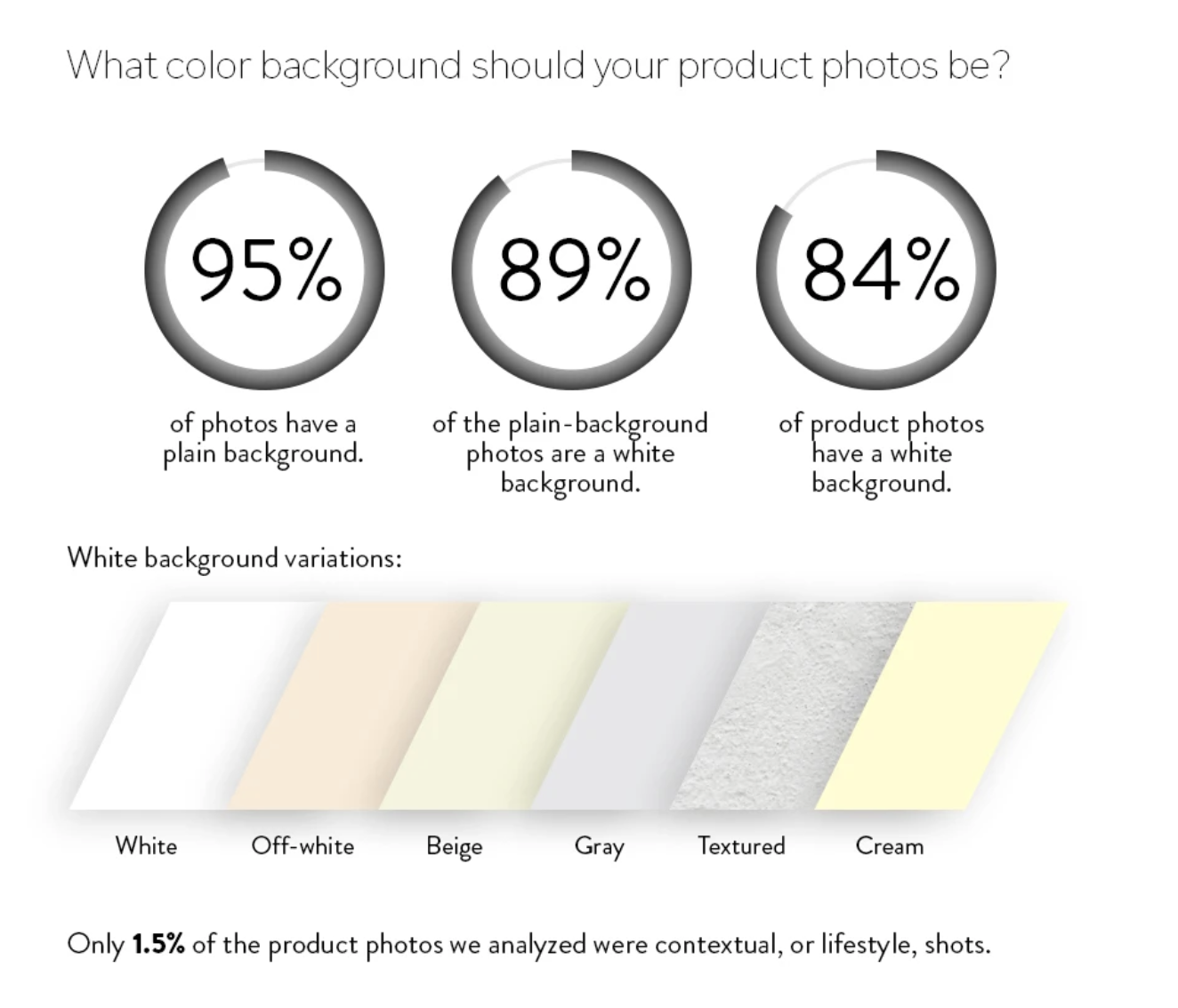
Image source
While a white background color is a common choice, the problem, however, is it’s easy to get ‘lost.’ Some creative professionals and even consumers believe white backgrounds to be a little ‘boring.”
Even a slight variation from white can help you stand out. Additionally, if your product is white, it can require a bit of editing and lighting to get right when using a white background.
There’s certainly nothing wrong with using a few different colored backgrounds to see which one looks best, but a white background does have it’s advantages.
“If I was photographing a technology product, the first thing that comes to mind is a pure white background or a plain background,” says Mark David.
Complement your brand colors
To get the most from your product photos, don’t forget that they need to go well with your brand colors. The last thing you want is to have a handful of quality photos that don’t match your website and brand color theme.
This is why planning your shoot beforehand is so important.
Using a tool like HTML Color Codes gives you an idea of which colors work best together.
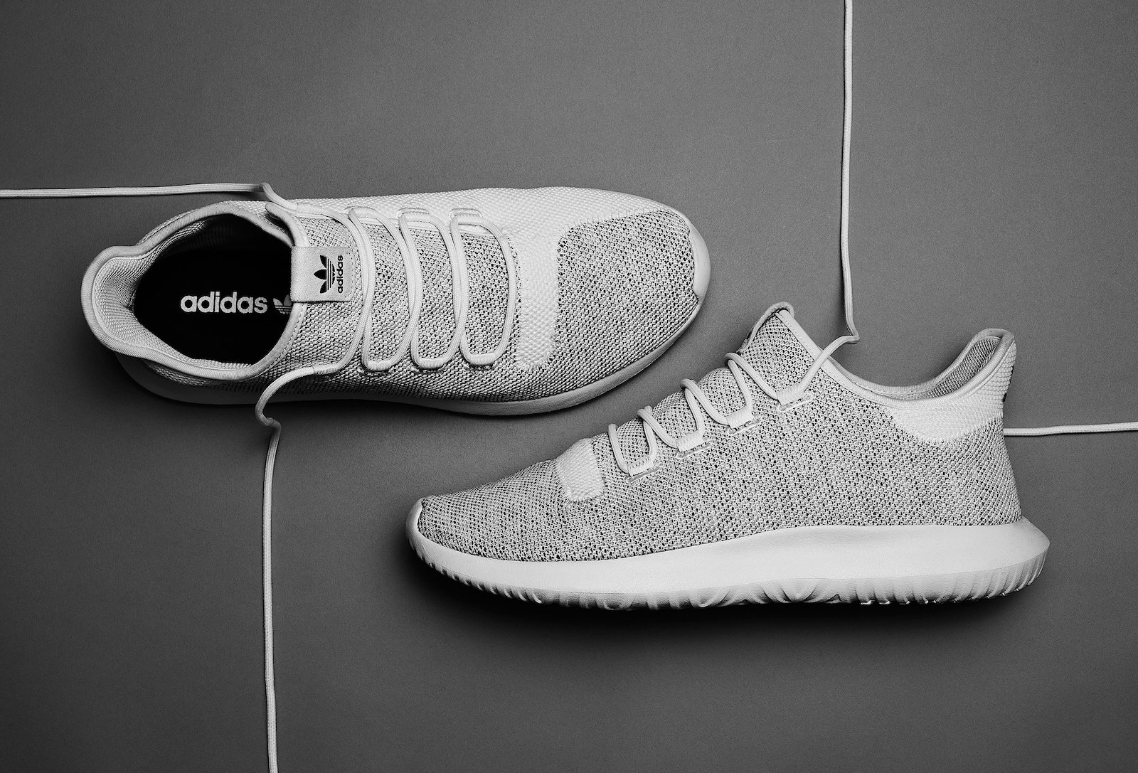
Image source
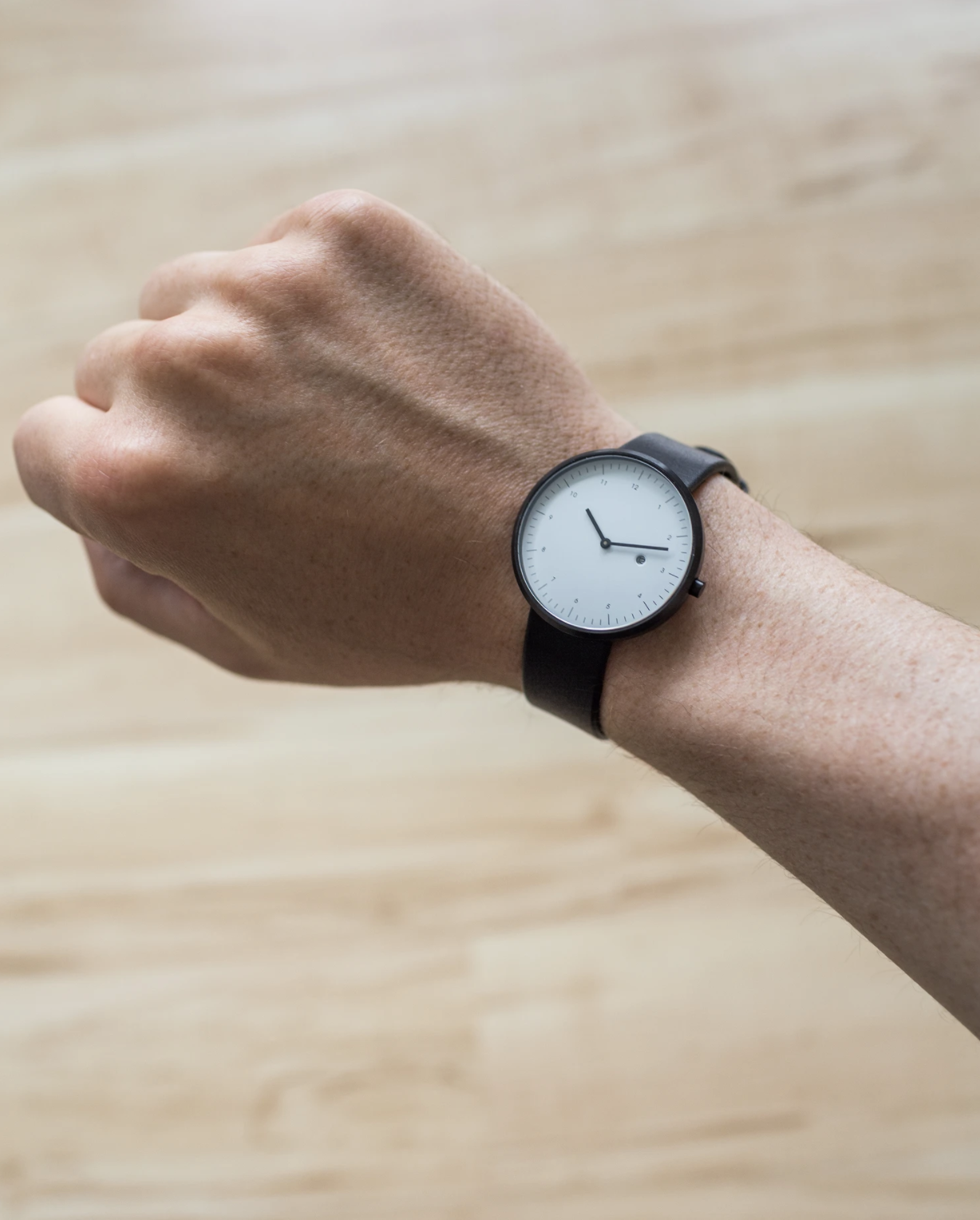
Image source
Consider where your product photos will be shown
Not only do your product photos need to look great on your own website, but you also need to consider the context of your photos for other placements such as an in-store display and on social media.
Social media: a neutral background is often a safe bet, but feel free to experiment with more ‘creative designs’ during post-production. Throughout the shoot, keep in mind the optimal image sizes for sharing on social media channels. You can also crop, add filters, and get extra creative when posting product photos on Instagram (or even Snapchat) using the editing tools available for each platform.
Remember, your product shoot can be a great time to create quality digital assets for marketing and helpful for repurposing your image assets in the future.
In-store signage and displays: If you plan on using your product photos for in-store displays and signage, make sure you’re considering that during your shoot. In-store displays typically need to highlight your product’s main benefits and pricing in an easy to read manner and often rely heavily on text.

Image source
Catalogs: Despite two decades of email and social media marketing stealing the show, catalog mailings have been steadily increasing since 2015. If you plan on using your photos in a catalog, spend part of your shoot with that in mind. With catalogs specifically, lighting and consistency of colors is especially important.
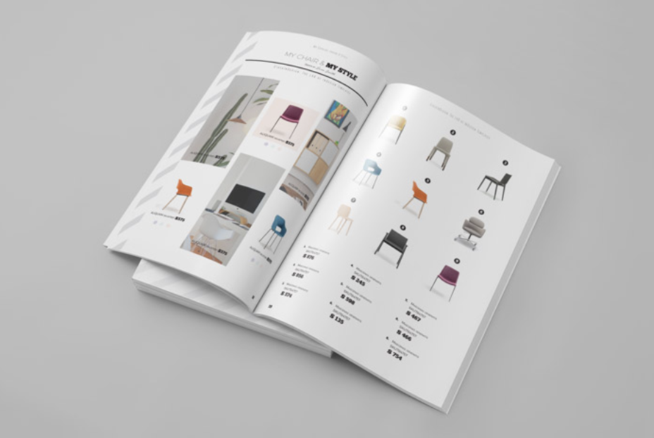
Image source
Ultimately, regardless of where your photos will be shown, context matters: 37% of online shoppers want to see your products contextually. When shoppers can see the product in use, they can envision using it in their own lives.
Start with neutral colors
As we’ve previously shared, “the safest play and closest to a standard white background, neutrals like off-white, gray or beige can highlight your products online. The neutrals won’t distract from your product, but it also allows you to apply a different visual aesthetic.”
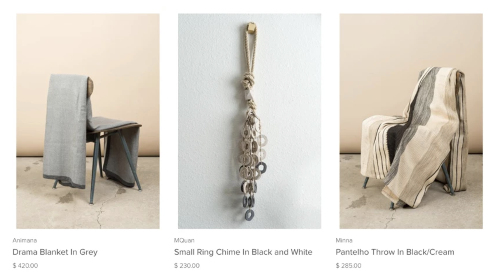
Image source
You can experiment with other background colors and textures as you get a better feel for how your products look when using a strong foundation such as white or neutral colors. Don’t feel as if you have to be perfect from the start; you’ll slowly get a better idea of what works each time you have a photoshoot.
If you’re looking for more options to consider, we wrote an in-depth article on nine alternatives to white backgrounds. You can read the article here.
Align with your ecommerce platform guidelines
Having photos look great is important for making your products stand out, but keep in mind that different ecommerce platforms have different guidelines.
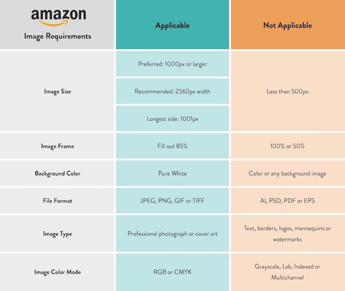
If you’re selling products on eBay, for example, they currently require product photos to have a white or gray background. While not directly related to the color of your photos, you also want to make sure your images are high quality at the required image sizes for each specific platform.
Before your shoot, get familiar with the requirements of the main platforms you intend to use to showcase your products. Here are the latest requirements for Amazon, for example.
Post-production essentials
We’ve covered a lot of ground so far. By making just a few adjustments to what color background you use, you can dramatically improve your shoot’s quality and success. That said, even with the perfect product photos, post-production is crucial for taking your photos the last mile.
Just as a well-written book goes through hours and hours of editing, quality product photos require editing as well.
In post-production, you’ll want to edit and tweak the lighting, size of your photos, and make any additional edits such as cropping. While post-production can often help you ‘save’ a poorly executed photoshoot, you want to make post-production as easy as possible with proper planning and a clear strategy for your shoot.
Bad lighting the day of the shoot? No problem, you can use a photo editing tool to help improve the lighting.
Capture a few unwanted items in the background while shooting? You can remove those as well in post-production.
Adding color backgrounds after the shoot
One of the most powerful aspects of post-production is the ability to change the background color you used during your shoot. Sometimes you just won’t have the perfect colored material when shooting—that’s okay! If you can’t find the colors you need, you can always add the color afterward. We have an excellent tutorial on how to add color to your product images in case your shoot didn’t go as planned.
While there are some great tools (both free and paid) online, don’t make the mistake of taking post-production lightly. Just as post-production can make your photos jump off the page, poor post-production can make a great shoot average.
Though it sometimes feels like the actual shoot is the most challenging part, there’s a lot of “little things” that go into getting it right. If you’re unhappy with how your product photos turned out, or need help making your backgrounds look better, our team of designers can help.
[cta text=”Learn how to outsource nitty-gritty background color changes to your virtual photo-editing studio” button=”Learn more” link=”https://clippingpathindia.com/pages/background-removal”]